Data visualization
Data visualization is rooted in Gestalt theory, which suggests that when faced with complexity, the human mind spontaneously structures visual information to simplify its interpretation.
Human vision accounts for 80 % of the information transmitted to the brain. The principle of data visualization is therefore to provide information in a manner that is both cognitively adapted and engaging from a human perspective.
« The greatest value of a picture is when it forces us to notice what we never expected to see ». ( John Tukey - one of the most important American statisticians of the 20th century ).
Data visualization allows large amounts of raw data to be transformed into clear and accessible information through the use of charts and other visual representations. It facilitates the understanding, analysis, and communication of data within a company or organization.
Measures & Dimensions
In data visualization, we no longer speak of quantitative or qualitative variables Data Properties, but of measures - key performance indicators ( KPI's ) - ( i.e. what do we want to analyze ) and dimensions ( i.e. by what means do we want to analyze this measure ).
For example, let's take sales amount as a key performance indicator ( KPI ). A measure is an aggregation ( min, max, sum, avg, etc. ) applied to a column in a table, and it usually involves aggregating a numerical and therefore quantitative column. For the sales amount, we have a table that includes an amount for each fruit, and we aggregate this column by applying a sum, Sum[Amount].
| Fruits | Amount |
|---|---|
| Apple | 40 |
| Blueberry | 100 |
| Cherry | 30 |
| Orange | 55 |
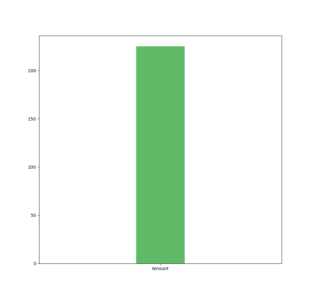
If we decide to visually represent the KPI « sales amount » sum[Amount] in a bar chart - therefore only a measure without a dimension - we get a single bar, as this is the most aggregated form of data ; only the measure, which is .
However, if we add the dimension « fruits » : we want to analyze sales by fruit ( this could be by store, by customer, etc. ) ; we get one bar per dimension value. The measure, which was in its most aggregated form, is now disaggregated by the values of the dimension used ; in this case : fruit values.
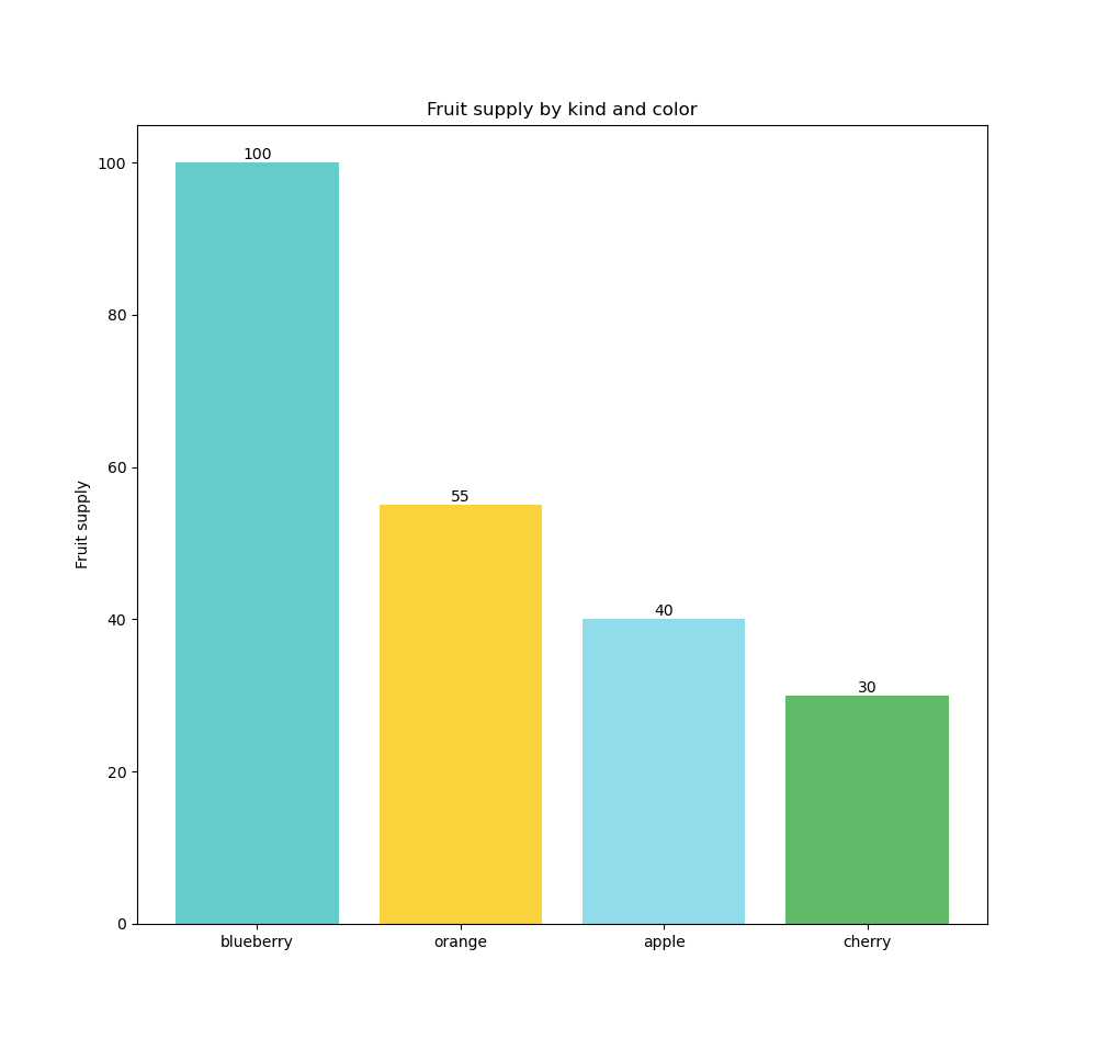
In the first case, by adding the measure, we obtain the most aggregated form ( = what do we want to analyze | answer : the sales amount ), and in the second case, by adding the dimension, we disaggregate ( break down ) the measure by as many values as exist in the dimension, resulting in four bars since there are four fruits.
A measure can also apply to a qualitative variable. For example : fruits - if we want to know how many fruits we have, we apply the « count » aggregation on fruits - Count[Fruits] ( which is a nominal qualitative variable ) and we get . The count aggregation is often used to create measures from qualitative variables.
Categories of Visuals
The most complex question in data visualization concerns the choice of the chart. Which chart for which measure and / or dimension ? It's important to specify that depending on the visualization, it is possible to add multiple dimensions and / or multiple measures.
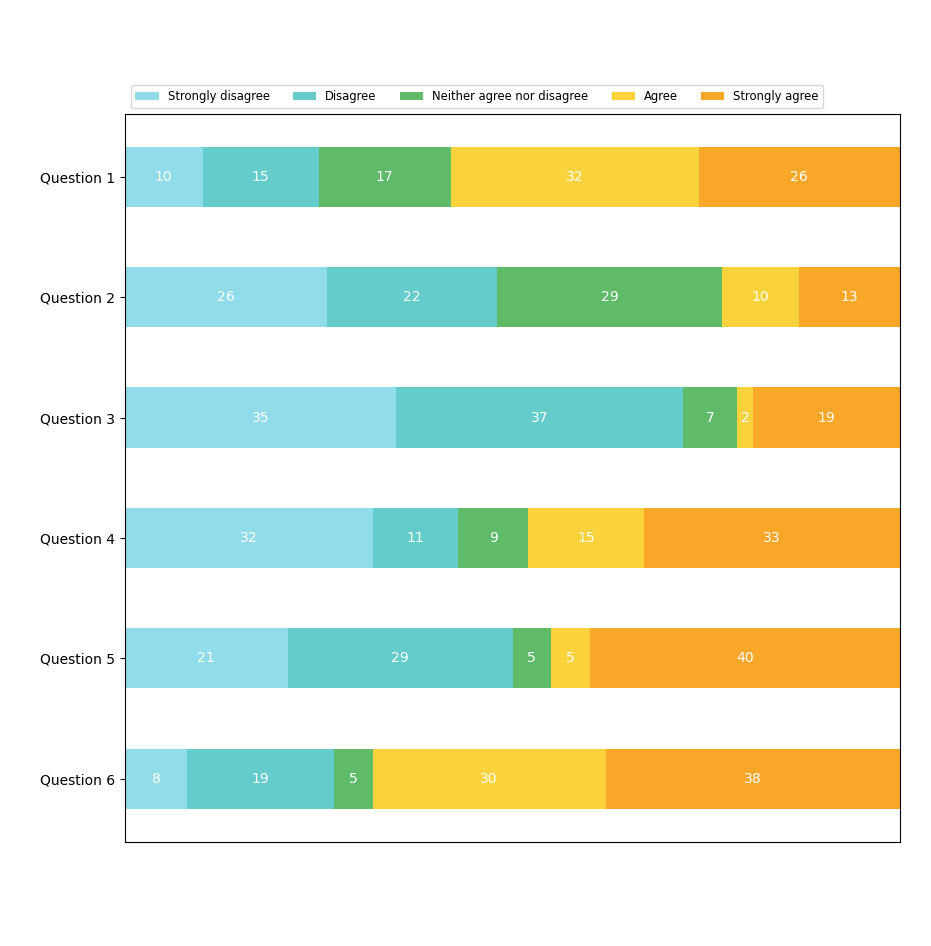
For example, a bar chart - the most popular graph because it is the most effective for the human brain - allows for several configurations : (1) horizontal vs vertical ; (2) 1 measure and 2 grouped dimensions ; (3) 1 measure and 2 stacked dimensions ; (4) 1 dimension multiple measures ; (5) stacked or non-stacked if there are multiple measures or multiple dimensions ; (6) grouped, normal stacked, or 100% stacked, etc.
The best recommendation when starting with data visualization is to keep simplicity in mind. The use of complex visualizations should only be applied when there is a certain level of data maturity within the organization. This means that when end users are accustomed to and trained in it. Otherwise, or when a project is initiated, it is recommended to focus on the most well-known ( and effective according to the situation ) visualizations, namely : bar chart, line chart, combo chart, pie chart, scatter plot, and tables ( straight & pivot ).
There are four basic types of presentations :
Comparison Visualizations
Comparison visualizations address basic questions when starting with data visualization, such as « which customer represents the highest sales ? » or « which product is the most expensive to purchase ? » or « How has the revenue evolved this year compared to last year ? ». These are used to compare the magnitude of values against each other to quickly identify the lowest and highest values or to compare current values with past values.
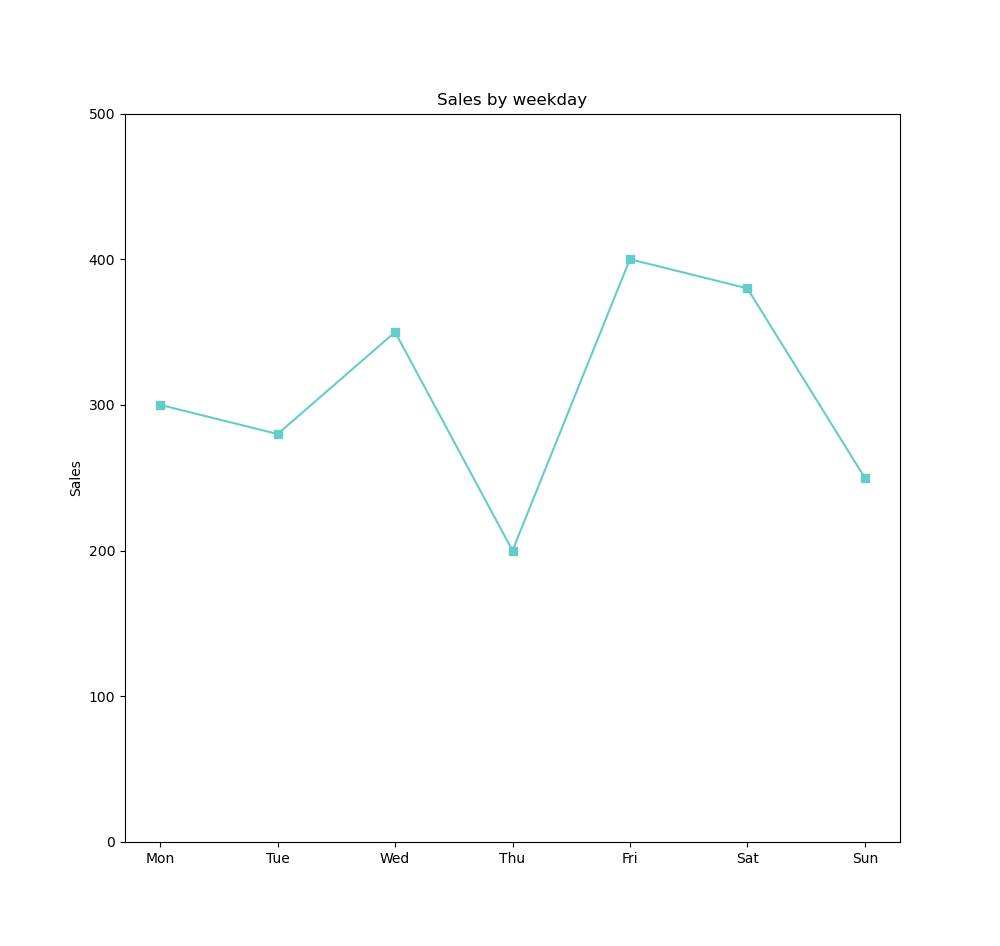
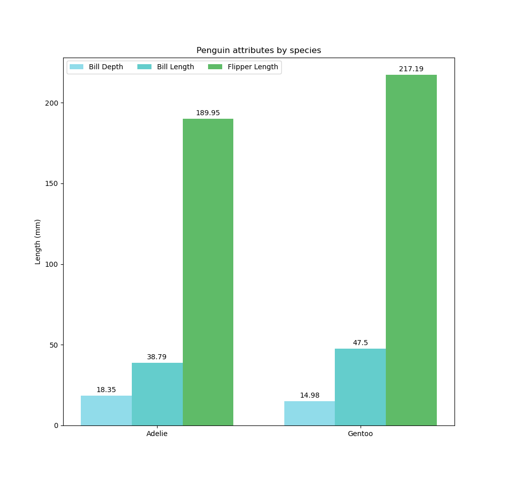
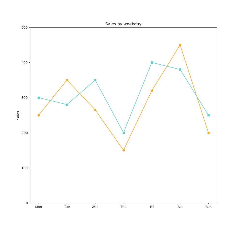
Bar chart 1 measure & 1 dimension ; Line Chart 1 measure & 1 dimension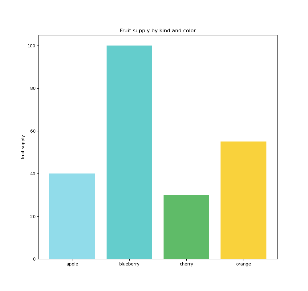
Relationship Visualizations
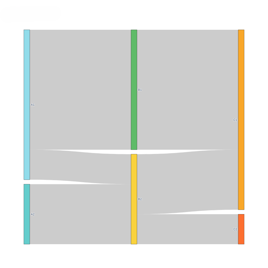
Relationship visualizations are used to identify correlations, outliers, or visualize clusters, i.e. groups of points where the points within a group are close to each other, but the groups are spaced apart. The scatter plot is the primary chart in this category.
Left : Scatter plot 3 measures ( Y-axis, X-axis + bubble size ) & 2 dimensions ( bubbles & bubble color ) : identification of correlations, outliers, or clusters ; Right : Sankey chart highlighting flow relationships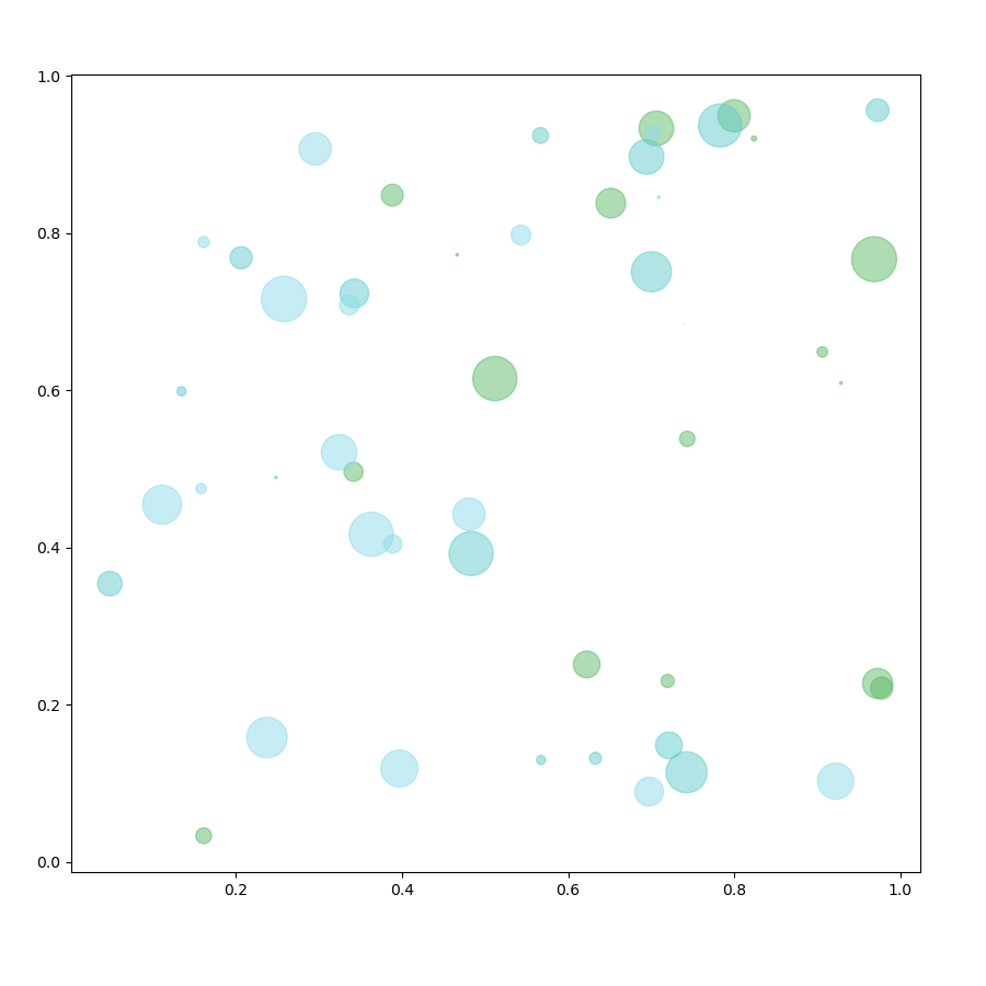
Composition Visualizations
Composition visualizations allow for comparing a value relative to a whole and often involve the concept of parts. Values are usually expressed as percentages. They are very useful for summarizing a set of nominal data or presenting the different values of a given variable ( percentage distribution ). They answer questions like « What is the sales share by region ? »
Pie chart & Donut Chart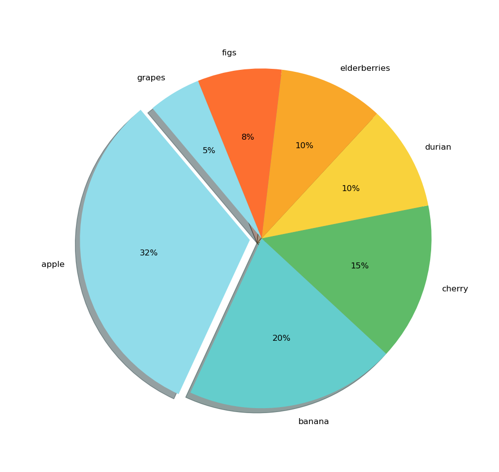
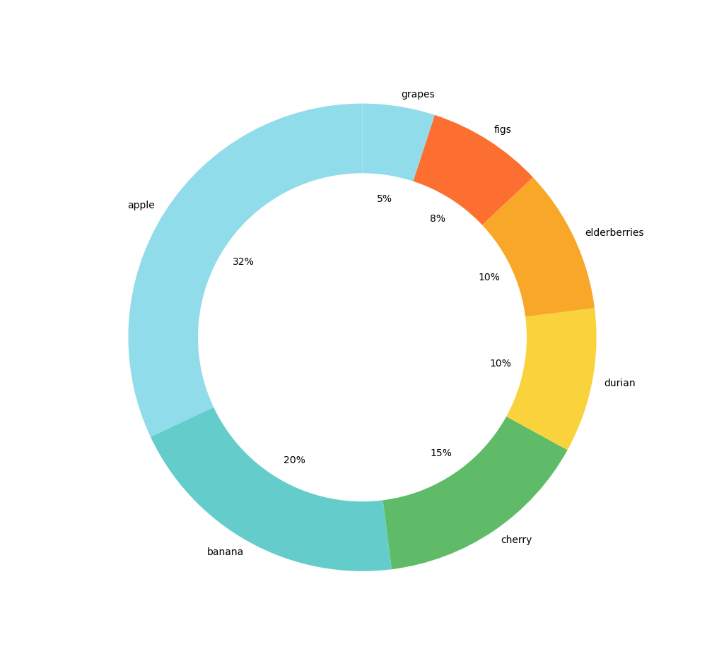
A best practice is to never use a dimension containing more than 7 different values, as interpretation becomes more difficult from a cognitive perspective, and in this case, it is better to switch to a bar chart.
Distribution Visualizations
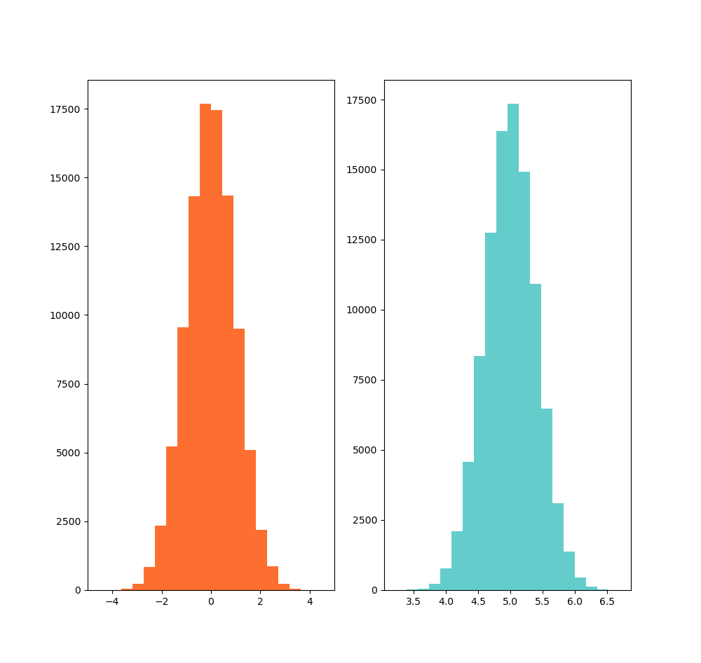
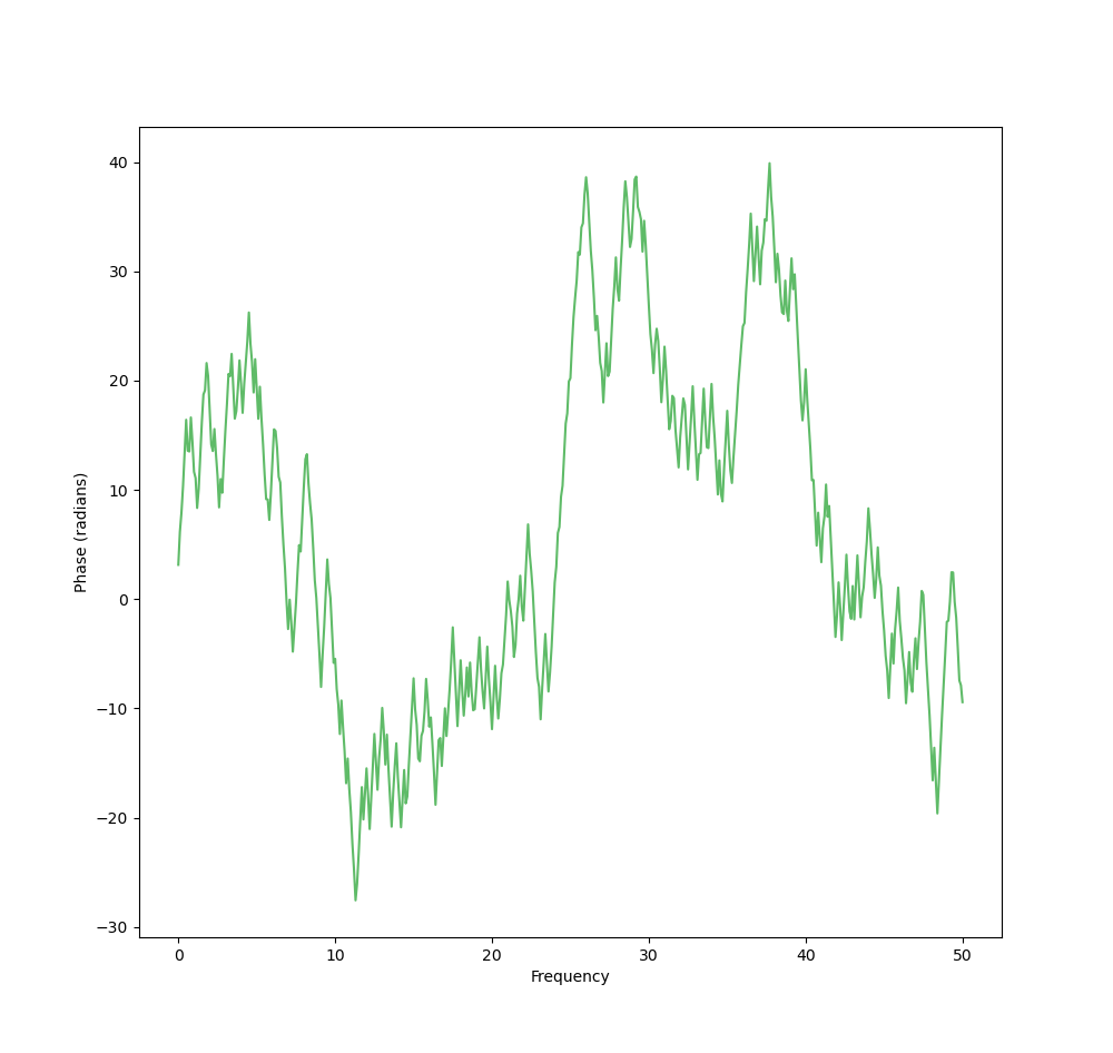
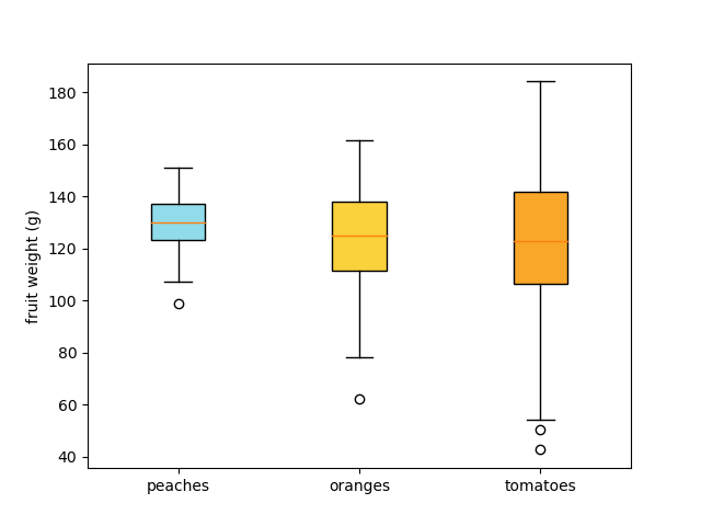
Distribution visualizations are used to highlight how quantitative values are distributed along an axis. These charts make it easy to identify the highest and lowest values, get an idea of the distribution shape, highlight basic descriptive values such as median, mean, or mode, and identify outliers.
Explore more on eaqbe.com :
-
Learn about RPA AI solutions: https://www.eaqbe.com/technologies
Transform your processes with intelligent automation powered by RPA and AI. -
Discover our consulting services: https://www.eaqbe.com/services
Tailored consulting to optimize your data and decision-making strategies. -
Explore our training programs: https://www.eaqbe.com/trainings
Build your expertise with targeted training sessions. -
Meet the eaqbe team: https://www.eaqbe.com/team
Discover the people driving innovation and excellence at eaqbe.
Python Codes
Looking for a specific visualization in Python? Find a wealth of visuals with examples at Python Graph Gallery (Select Chart Types).
Bar Chart
import matplotlib.pyplot as plt

fig, ax = plt.subplots(figsize=(10, 10))

fruits = ['apple', 'blueberry', 'cherry', 'orange']
counts = [40, 100, 30, 55]
bar_labels = ['red', 'blue', '_red', 'orange']
colors = ['#91DCEA', '#64CDCC', '#5FBB68', '#F9D23C', '#F9A729', '#FD6F30']


combined = sorted(zip(counts, fruits, bar_labels, colors), reverse=True)

counts, fruits, bar_labels, colors = zip(*combined)
bars = ax.bar(fruits, counts, label=bar_labels, color=colors[:len(fruits)])

ax.bar_label(bars, label_type='edge')
ax.set_ylabel('Fruit supply')
ax.set_title('Fruit supply by kind and color')

plt.show()
Line Chart
import matplotlib.pyplot as plt

day = ['Mon','Tue','Wed','Thu','Fri','Sat','Sun']
#sales_product1 = [250,350,265,150,320,450,200]
sales_product2 = [300, 280, 350, 200, 400, 380, 250]
colors = ['#91DCEA', '#64CDCC', '#5FBB68',
          '#F9D23C', '#F9A729', '#FD6F30']
plt.figure(figsize=(10, 10))

#plt.plot(day, sales_product1, color='#F9A729', marker='o', label='Product 1')
plt.plot(day, sales_product2, color='#64CDCC', marker='s', label='Product 2')


#for i, sale in enumerate(sales_product1):
     #plt.annotate(str(sale), (day[i], sale), textcoords="offset points", xytext=(0,10), ha='center')
for i, sale in enumerate(sales_product2):
     plt.annotate(str(sale), (day[i], sale), textcoords="offset points", xytext=(0,-10), ha='center')


plt.ylabel('Sales')
plt.title('Sales by weekday')
plt.ylim(0, 500)
plt.show()
Bar Chart Grouped
import matplotlib.pyplot as plt
import numpy as np

species = ("Adelie", "Gentoo")


penguin_means = {
    'Bill Depth': (18.35, 14.98),
    'Bill Length': (38.79, 47.50),
    'Flipper Length': (189.95, 217.19),
}

x = np.arange(len(species))
width = 0.25
multiplier = 0

colors = ['#91DCEA', '#64CDCC', '#5FBB68', '#F9D23C', '#F9A729', '#FD6F30']


fig, ax = plt.subplots(figsize=(10, 10))


for i, (attribute, measurement) in enumerate(penguin_means.items()):
    offset = width * multiplier
    rects = ax.bar(x + offset, measurement, width, label=attribute, color=colors[i % len(colors)])
    ax.bar_label(rects, padding=3)
    multiplier += 1


ax.set_ylabel('Length (mm)')
ax.set_title('Penguin attributes by species')
ax.set_xticks(x + width, species)
ax.legend(loc='upper left', ncols=3)
#ax.set_ylim(0, 250)

plt.show()
Line Chart Grouped
# LineChart python
import matplotlib.pyplot as plt

day = ['Mon','Tue','Wed','Thu','Fri','Sat','Sun']
sales_product1 = [250,350,265,150,320,450,200]
sales_product2 = [300, 280, 350, 200, 400, 380, 250]
colors = ['#91DCEA', '#64CDCC', '#5FBB68',
          '#F9D23C', '#F9A729', '#FD6F30']
plt.figure(figsize=(10, 10))

plt.plot(day, sales_product1, color='#F9A729', marker='o', label='Product 1')
plt.plot(day, sales_product2, color='#64CDCC', marker='s', label='Product 2')


for i, sale in enumerate(sales_product1):
     plt.annotate(str(sale), (day[i], sale), textcoords="offset points", xytext=(0,10), ha='center')
for i, sale in enumerate(sales_product2):
     plt.annotate(str(sale), (day[i], sale), textcoords="offset points", xytext=(0,-10), ha='center')


plt.ylabel('Sales')
plt.title('Sales by weekday')
plt.ylim(0, 500)
plt.show()
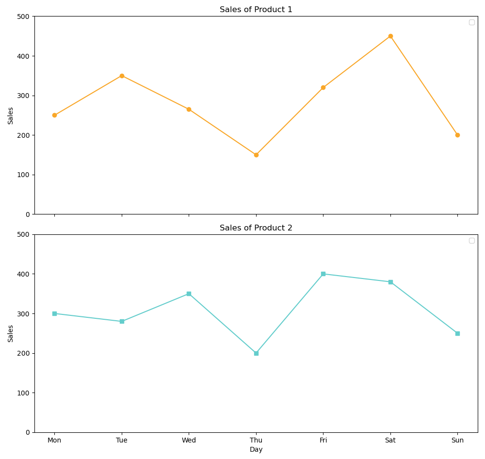
Treilli Line Chart
# Treilli Line Chart python

import matplotlib.pyplot as plt


day = ['Mon','Tue','Wed','Thu','Fri','Sat','Sun']
sales_product1 = [250, 350, 265, 150, 320, 450, 200]
sales_product2 = [300, 280, 350, 200, 400, 380, 250]

fig, (ax1, ax2) = plt.subplots(nrows=2, ncols=1, figsize=(10, 10), sharex=True)

ax1.plot(day, sales_product1, color='#F9A729', marker='o')
ax1.set_ylabel('Sales')
ax1.set_title('Sales of Product 1')
ax1.set_ylim(0, 500)
ax1.legend()

ax2.plot(day, sales_product2, color='#64CDCC', marker='s')
ax2.set_xlabel('Day')
ax2.set_ylabel('Sales')
ax2.set_title('Sales of Product 2')
ax2.set_ylim(0, 500)
ax2.legend()

plt.tight_layout()

plt.show()
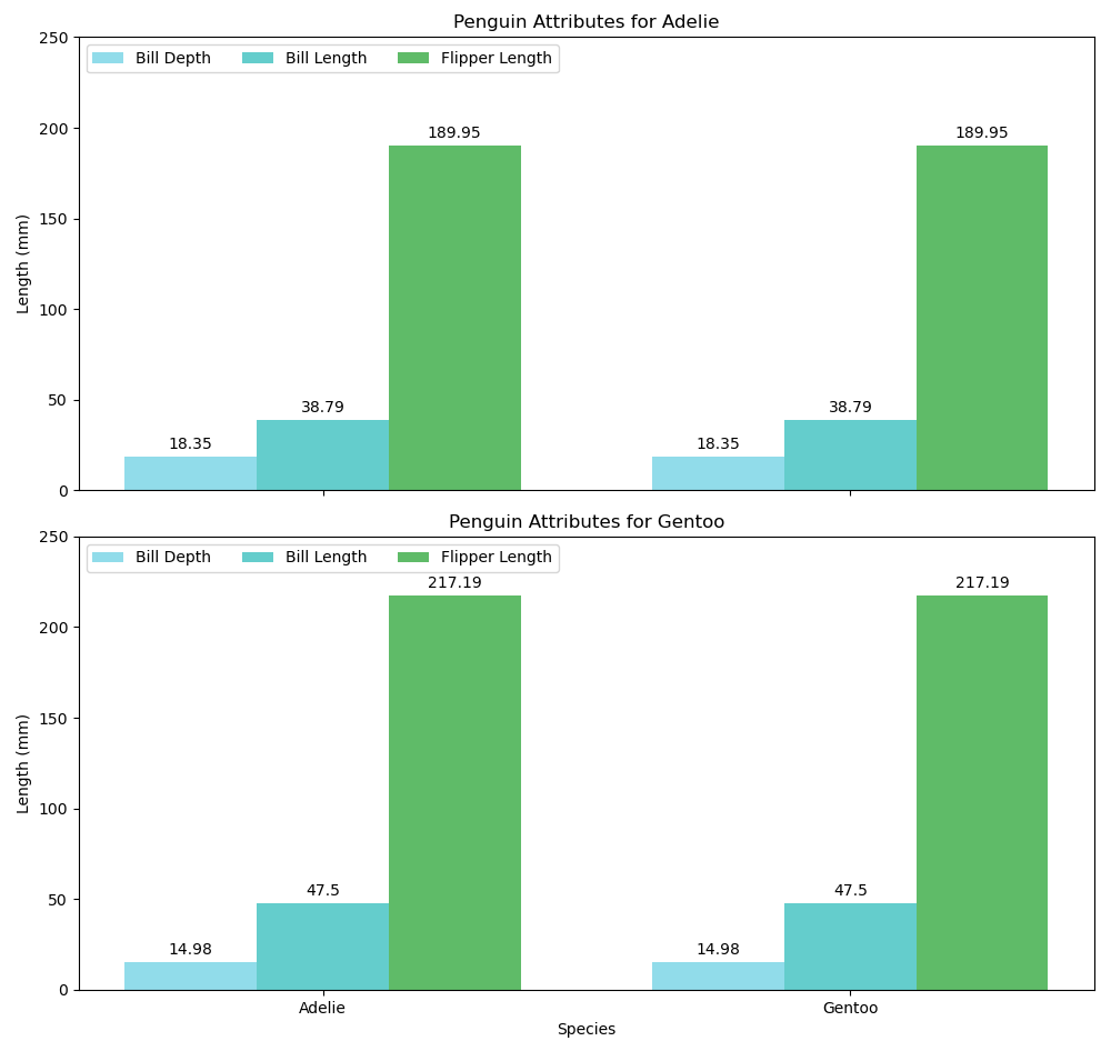
Treilli Bar Chart
# TrelliB Bar Chart Python
import matplotlib.pyplot as plt
import numpy as np


species = ("Adelie", "Gentoo")


penguin_means = {
    'Bill Depth': (18.35, 14.98),
    'Bill Length': (38.79, 47.50),
    'Flipper Length': (189.95, 217.19),
}

x = np.arange(len(species))
width = 0.25

colors = ['#91DCEA', '#64CDCC', '#5FBB68', '#F9D23C', '#F9A729', '#FD6F30']

fig, (ax1, ax2) = plt.subplots(nrows=2, ncols=1, figsize=(10, 10), sharex=True)


for i, (attribute, measurement) in enumerate(penguin_means.items()):
    rects = ax1.bar(x + i * width, [measurement[0]], width, label=attribute, color=colors[i % len(colors)])
    ax1.bar_label(rects, padding=3)

ax1.set_ylabel('Length (mm)')
ax1.set_title('Penguin Attributes for Adelie')
ax1.set_xticks(x + width, species)
ax1.legend(loc='upper left', ncols=3)
ax1.set_ylim(0, 250)

for i, (attribute, measurement) in enumerate(penguin_means.items()):
    rects = ax2.bar(x + i * width, [measurement[1]], width, label=attribute, color=colors[i % len(colors)])
    ax2.bar_label(rects, padding=3)

ax2.set_xlabel('Species')
ax2.set_ylabel('Length (mm)')
ax2.set_title('Penguin Attributes for Gentoo')
ax2.set_xticks(x + width, species)
ax2.legend(loc='upper left', ncols=3)
ax2.set_ylim(0, 250)

plt.tight_layout()

plt.show()
Scatter Plot
# Scatter plot python

import matplotlib.pyplot as plt
import numpy as np
import pandas as pd
from matplotlib.colors import ListedColormap


np.random.seed(19680801)

N = 50
x = np.random.rand(N)
y = np.random.rand(N)

z = np.random.rand(N)

color_dimension = pd.qcut(z, 3, labels=False)

area = (30 * np.random.rand(N))**2

colors = ['#91DCEA', '#64CDCC', '#5FBB68']
cmap = ListedColormap(colors)

fig, ax = plt.subplots(figsize=(10, 10))

scatter = ax.scatter(x, y, s=area, c=color_dimension, alpha=0.5, cmap=cmap)

plt.show()
Sankey Chart
# Sankey Chart python

import plotly.graph_objects as go


colors = ['#91DCEA', '#64CDCC', '#5FBB68', '#F9D23C', '#F9A729', '#FD6F30']

fig = go.Figure(data=[go.Sankey(
    node = dict(
        pad = 15,
        thickness = 20,
        line = dict(color = "black", width = 0.5),
        label = ["A1", "A2", "B1", "B2", "C1", "C2"],
        color = colors
    ),
    link = dict(
        source = [0, 0, 1, 2, 3, 3],
        target = [2, 3, 3, 4, 4, 5],
        value =  [8, 2, 4, 8, 4, 2],
    ))])


fig.update_layout(
    title_text=" Sankey Chart",
    font_size=10,
    width=1200,
    height=1200
)

fig.show()
Pie Chart
# Pie Chart python

import matplotlib.pyplot as plt

labels = 'apple', 'banana', 'cherry', 'durian', 'elderberries', 'figs', 'grapes'
sizes = [32, 20, 15, 10, 10, 8, 5]
colors = ['#91DCEA', '#64CDCC', '#5FBB68',
          '#F9D23C', '#F9A729', '#FD6F30']

plt.figure(figsize=(10, 10))
p = plt.pie(sizes, labels=labels, colors=colors, explode=(0.07, 0, 0, 0, 0, 0, 0),
            autopct='%1.0f%%', startangle=130, shadow=True)
plt.axis('equal')

for i, (apple, banana, cherry, durian, elderberries, figs, grapes) in enumerate(p):
    if i > 0:
        apple.set_fontsize(12)
        banana.set_fontsize(12)
        cherry.set_fontsize(12)
        durian.set_fontsize(12)
        elderberries.set_fontsize(12)
        figs.set_fontsize(12)
        grapes.set_fontsize(12)

plt.show()
Donnut Chart
# Donnut Chart python

import matplotlib.pyplot as plt

labels = 'apple', 'banana', 'cherry', 'durian', 'elderberries', 'figs', 'grapes'
sizes = [32, 20, 15, 10, 10, 8, 5]

my_circle = plt.Circle((0, 0), 0.7, color='white')
colors = ['#91DCEA', '#64CDCC', '#5FBB68',
          '#F9D23C', '#F9A729', '#FD6F30']
plt.figure(figsize=(10, 10))
d = plt.pie(sizes, labels=labels,colors=colors, autopct='%1.0f%%',
            startangle=90, labeldistance=1.05)

plt.axis('equal')
plt.gca().add_artist(my_circle)

plt.show()
Bar Chart Stacked 100 %
# Stacked Bar CHart 100% python

import matplotlib.pyplot as plt
import numpy as np
import matplotlib.colors as mcolors

category_names = ['Strongly disagree', 'Disagree',
                  'Neither agree nor disagree', 'Agree', 'Strongly agree']
results = {
    'Question 1': [10, 15, 17, 32, 26],
    'Question 2': [26, 22, 29, 10, 13],
    'Question 3': [35, 37, 7, 2, 19],
    'Question 4': [32, 11, 9, 15, 33],
    'Question 5': [21, 29, 5, 5, 40],
    'Question 6': [8, 19, 5, 30, 38]
}

colors = ['#91DCEA', '#64CDCC', '#5FBB68', '#F9D23C', '#F9A729']

def survey(results, category_names):
    labels = list(results.keys())
    data = np.array(list(results.values()))
    data_cum = data.cumsum(axis=1)
    fig, ax = plt.subplots(figsize=(10, 10))
    ax.invert_yaxis()
    ax.xaxis.set_visible(False)
    ax.set_xlim(0, np.sum(data, axis=1).max())

    for i, (colname, color) in enumerate(zip(category_names, colors)):
        widths = data[:, i]
        starts = data_cum[:, i] - widths
        rects = ax.barh(labels, widths, left=starts, height=0.5,
                        label=colname, color=color)

        r, g, b = mcolors.to_rgb(color)
        text_color = 'white' if r * g * b < 0.5 else 'darkgrey'
        ax.bar_label(rects, label_type='center', color=text_color)
    ax.legend(ncols=len(category_names), bbox_to_anchor=(0, 1),
              loc='lower left', fontsize='small')

    return fig, ax

survey(results, category_names)
plt.show()
Waterfall
# waterfall python

import plotly.graph_objects as go


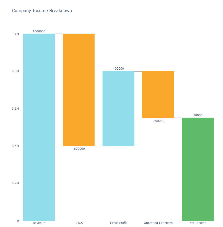
categories = ['Revenue', 'COGS', 'Gross Profit', 'Operating Expenses', 'Net Income']
values = [1000000, -600000, 400000, -250000,  70000]


colors = ['#91DCEA', '#64CDCC', '#5FBB68', '#F9D23C', '#F9A729', '#FD6F30']


cumulative_values = [0]
for value in values:
    cumulative_values.append(cumulative_values[-1] + value)


fig = go.Figure(go.Waterfall(
    name = "20",
    orientation = "v",
    measure = ["relative"] * (len(values) - 1) + ["total"],
    x = categories,
    textposition = "outside",
    text = values,
    y = values,
    connector = {"line":{"color":"rgb(63, 63, 63)"}},
    increasing = {"marker":{"color": '#91DCEA'}},
    decreasing = {"marker":{"color": '#F9A729'}},
    totals = {"marker":{"color": '#5FBB68'}}
))


fig.update_layout(
    title = "Company Income Breakdown",
    showlegend = True,
    width=1000,
    height=1000,
    plot_bgcolor='white'
)

fig.show()
Treemap
# Tree Map python


import matplotlib.pyplot as plt
import squarify    # pip install squarify
import pandas as pd

colors = ['#91DCEA', '#64CDCC', '#5FBB68',
          '#F9D23C', '#F9A729', '#FD6F30']


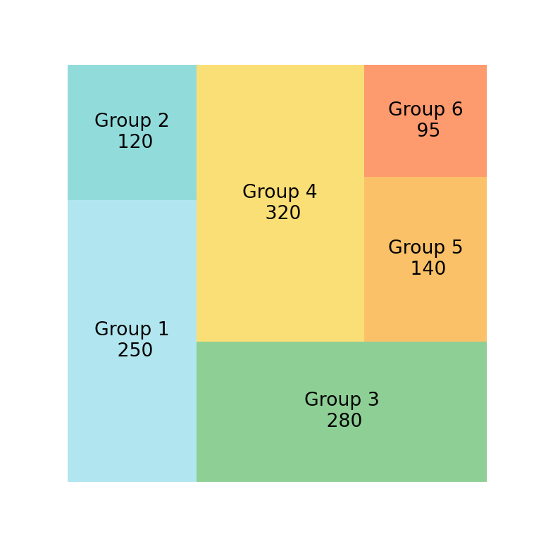
df = pd.DataFrame({'nb_people':[8,3,4,2], 'group':["group A", "group B", "group C", "group D"] })


squarify.plot(sizes=df['nb_people'],color=colors, label=df['group'], alpha=.8 )
plt.axis('off')
plt.show()
Line Chart Stacked
# Stacked Line Chart python


import numpy as np
import matplotlib.pyplot as plt


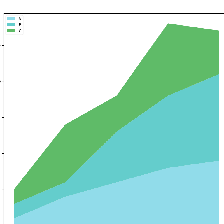
x=range(1,6)
y=[ [1,4,6,8,9], [2,2,7,10,12], [2,8,5,10,6] ]
colors = ['#91DCEA', '#64CDCC', '#5FBB68',
          '#F9D23C', '#F9A729', '#FD6F30']


plt.figure(figsize=(10, 10))
plt.stackplot(x,y, labels=['A','B','C'], colors=colors)
plt.legend(loc='upper left')
plt.show()
Histogram
# Histogram python

import matplotlib.pyplot as plt
import numpy as np

from matplotlib import colors
from matplotlib.ticker import PercentFormatter


rng = np.random.default_rng(19680801)

N_points = 100000
n_bins = 20


dist1 = rng.standard_normal(N_points)
dist2 = 0.4 * rng.standard_normal(N_points) + 5

fig, axs = plt.subplots(1, 2,figsize=(10, 10))

axs[0].hist(dist1, bins=n_bins, color='#FD6F30')
axs[1].hist(dist2, bins=n_bins, color='#64CDCC')

plt.show()
Candles
# Candles python

import matplotlib.pyplot as plt
import numpy as np

np.random.seed(19680801)
fruit_weights = [
    np.random.normal(130, 10, size=100),
    np.random.normal(125, 20, size=100),
    np.random.normal(120, 30, size=100),
]
labels = ['peaches', 'oranges', 'tomatoes']
colors = ['#91DCEA', '#F9D23C', '#F9A729']

fig, ax = plt.subplots()
ax.set_ylabel('fruit weight (g)')

bplot = ax.boxplot(fruit_weights,
                   patch_artist=True)

ax.set_xticklabels(labels)


for patch, color in zip(bplot['boxes'], colors):
    patch.set_facecolor(color)

plt.show()